Hi gang,
Here’s a quick update on a couple of new features we’ve rolled out over the past few days!
Does Your Brand Need More Exposure?
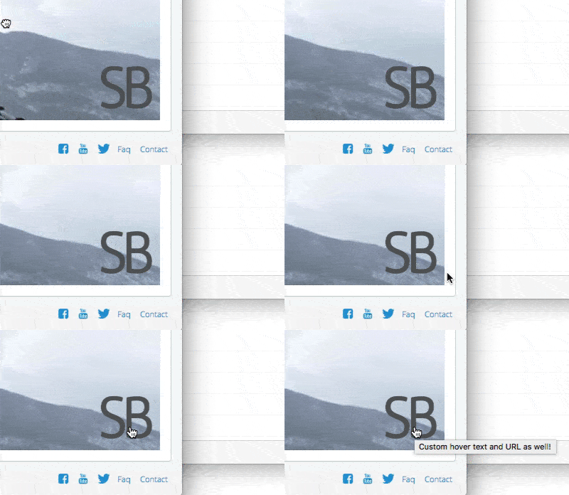
Who doesn’t love seeing their name in lights? Well, you’ll be happy to know that we now allows you to have your company logo overlaid on top of your Snaps. Transparency is supported with .png files, you can place the logo in any corner, and you can easily adjust the size from ‘teeny-tiny’ to ‘ego maniac’!
Since people like to click on logos, we’ve also added the ability for you to enter a custom URL, as well as a custom hover title.
If you don’t have a logo, we’ve still got you covered. We will show a text based hyperlink of your choosing for your viewers to click on.
As with all the other preferences, this can be applied per Snap, per Group, or as your default for new Snaps you create.

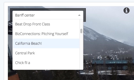
Text Navigation Dropdown.
Considering all the flashy features we’ve been putting out lately, this is fairly visually bland. But looks can be deceiving!
This is a new Preference that you can turn on with the flick of a switch, and place in any corner of your image. It allows for quick text based navigation.
The dropdown can list either all Snaps in the current Snap’s Group, or all the Snaps linked together by Snap Hotspots that you’ve placed.
This means that if you’ve created some mini tours in a larger Group of Snaps, you can just show the Snaps in that tour. If you want to show everything in the whole Group even though some Snaps aren’t linked via Snap Hotspots, hooray, you can do that too!
This preference is available now, for free, to everyone on our platform.

We love to see what you’re making.
There’s plenty more cool stuff coming from us, and we’re loving all the great content you all are creating with the platform. Don’t be shy, follow us on Facebook and Twitter using the icons below, and show us what you’re making!
Leave a reply
You must be logged in to post a comment.